30 November 2012

How I proposed using a Chrome extension


Yup, I'm a geek. Everybody who knows me knows that.
As you can tell by the title of this post, here's how I proposed to my girlfriend by developing a Chrome extension (there's an added bonus at the end on how my mom discovered on Twitter that I had proposed).

When I decided to propose to my girlfriend I knew it would be geeky. Not Star Wars geeky, I'm not that hardcore, but something geeky nonetheless (and she is totally not a geek so any l33t speak would not work).

I threw around a few ideas. I knew I wanted to surprise her out of the blue, I wanted to do something that required investment (and not just half-ass it), but I didn't want it to be too grandiose (we're both not into those kinds of things).

Eventually I decided that I wanted to mess with her on Facebook.
Then I got the idea of creating a Chrome extension (after all, I was a long time at Conduit :) that injects JavaScript into her Facebook and would let me change stuff there.

Since this was a marriage proposal, the obvious place to mess with her on Facebook was the relationship status. This is what I came up with...

The first step was to ask her for some pretty basic stuff:
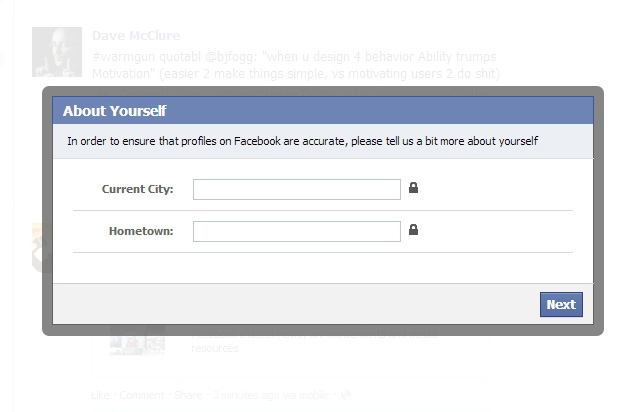
I was pretty sure that she would get annoyed with it and not want to cooperate so I added the little locks to give an impression that the information is private.

In the second step, it would ask her to update her relationship status. No matter what relationship status she chose it continued as if she had selected "Married".
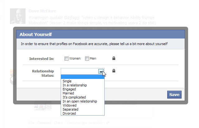
and then she'd get this confirmation dialog:
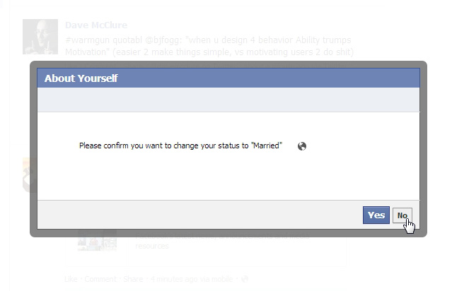
The idea was that she would think she chose "Married" by accident and then hit the "No" to go back and then see that "Married" was selected.

After finally agreeing to update her relationship status she would then see this dialog:
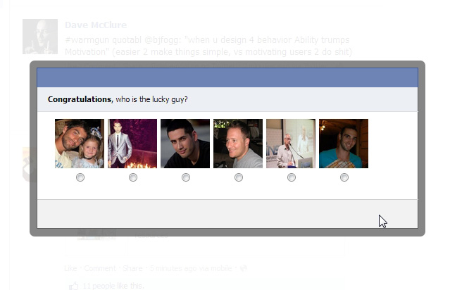
Those are all profile pictures of male facebook friends she has, not including me.
After a few seconds those pictures would fade out and my profile picture would slide in and she'd see this:
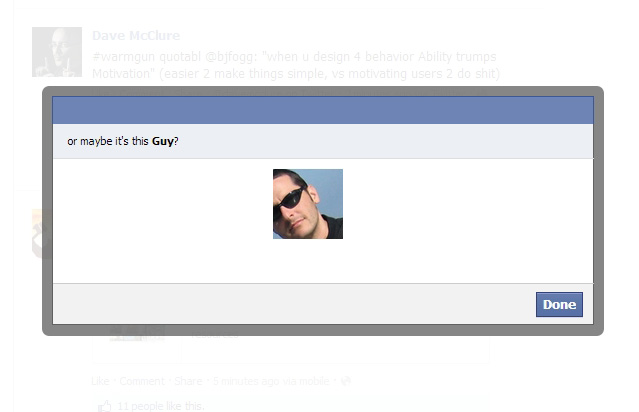

I thought that at that point she'd understand and I would be standing there with the ring.


My good friend Adiel helped with the development of the extension and we set it up so that I could remotely control when to run the injected Javascript (thanks again Adiel!).

I loaded up the extension on her laptop during the night and my goal was to get her to check Facebook on her laptop during the next day (the next day was 10/11/12 a nice date to propose on, right?).
Easier said than done.

The extension was loaded up on her laptop, I had the ftp to the server open ready to enable the extension remotely, but she wouldn't go to her computer.

So I decided to send her this message on Facebook:
You have to check this out:

The idea was that she'd get that message on her iPhone and think it wasn't working properly so she'd check it on her laptop. Worked like a charm... she went up and opened Facebook on her laptop.

As soon as I saw she loaded up Facebook I enabled the extension.

She got the "Facebook update your details wizard", got annoyed, and closed the page.
She reopened Facebook, hoping it would disappear, but the damn thing was back (hee hee).
After getting annoyed at it a bit she called me over to show me what Facebook was forcing her to do... so far everything was progressing as planned...

I took a look at it and told her I had no idea what that thing was but since there's a lock there she had nothing to worry about, the information would be private.

Reluctantly, she filled out the first step (home town) and got to the next step with the relationship status. She got really annoyed at that :)


I told her not to worry that she could just choose "single". She looked at me like I was nuts :)
(neither one of us had ever updated their Facebook relationship status till then)

Eventually she chose "single", hit next, and got the "Please confirm you are updating to Married" screen. Just as planned, she thought she made a mistake and went back. There she saw that "married" was selected and chose single again.
Of course the second time it asked her to confirm "married" really pissed her off :)
At this point I told her to just hit next, who cared. She was't willing to and told me to do it. I ended up hitting next to confirm, thinking that she would immediately understand what was going on on the next screen.

The faces came up and again she looked confused, asking me "what the hell is this?". I said "dunno", knowing that my pic would come up in a sec (the ring was already in my hand at this point, she had no idea).

A few seconds later my picture slided in and I looked at her, sure that she knew what was going on, and pulled out the ring.

She was floored :)
She had no idea till that second what was going on (mission accomplished :).

Luckily for me, she said yes!

A few minutes of mushiness ensued while we collected ourselves and indulged in the moment, and then I explained to her how the whole thing worked.

To top all this off, the next thing I obviously had to do was update my Twitter with the good news and that was how my Mom found out I proposed. When I called her to tell her the good news she answered saying "I need to discover on Twitter that you proposed?". She was a great sport about it :)

Like I said, yup, I'm a geek.
Share:

22 April 2012

Employee Equity by Fred Wilson


Just saw this great talk by Fred Wilson, principal of Union Square Ventures, about employee equity.
It's a bit long but if you are building a company try to put an hour aside to watch this.

The video of the entire talk is embedded below, and here's a link to Fred's post about it.


There are useful tips and best practices scattered across the entire talk so it's worth listening to, but if you don't have the time/patience here are the highlights.

The high level concept of the entire talk is that "if anybody goes to the pay window, everybody goes to the pay window". Meaning that everybody in the company should be an integral part of the ride and be compensated accordingly in the case that the entrepreneur and founders get their payday by selling the company, IPO, etc...

At the beginning of the talk (minute 3:37-10:40) Fred explains the basics of dilution, giving an example of a common scenario where a founder brings on a founding team, then some seed investors who also get equity, an employee equity pool, and a VC investment. The example shows how the founder gets diluted as more people get a bite of the pie (as do everybody else along the line).

He then goes on to explain various tax implications of options vs. stock and different vesting plans for employees, founders, and the founding team.

In my opinion, the most important part of the talk starts at minute 32:50 where Fred discusses a technique that he uses for how to calculate how many shares to give a specific employee (it goes till about minute 42:00).

Here's how to determine how much stock to give a specific employee:

First of all you need to put down your own real valuation of your company. This is not an official number or something that a 409A firm comes up with (more on that in the beginning of this video, if you're interested), it's how much you really think your company is worth at that point in time. In his example it's $25M.

Next you need to bucket your employees into 4 buckets and their multipliers:
  • Senior team (CFO, CMO, CPO... executives who report to the CEO): 0.5x - 1x
  • Junior VP level/directors (people who report to the senior team): 0.25x - 0.5x
  • Key hires (engineers, designers,... people who are hard to hire and hard to retain): 0.1x - 0.25x
  • Everybody else: 0.05x - 0.1x
The multiplier ranges are so you can tune it according to your specific market and how competitive/hard to find certain people it is. Geography also affects what multiplier to use.

Now determine the market cash compensation for these people, not what you're gonna pay them, what they would get paid at a competing or big company. In his example it's a CFO who would make $250K annually (you're paying him $175K but he could make $250K on the market).
You then take that number and multiply it by that person's matching multiplier. In this case he used 0.75 which gets to $187,500 which is the dollar value of the equity that you're gonna give the CFO.

All you need now is to see how many shares you have outstanding, and divide. In his example he used 10 million outstanding shares. So you divide the valuation you came up with by the number of outstanding shares to get the price per share (in his example, $25M/10M=$2.5 per share).
Now just divide the equity dollar value that you calculated for that employee by the share price to get how many shares to grant that person. In this example, $187,500 / $2.5 = 75,000 shares (Fred has a calculation error on the board in the class).

Note that the price per share that the employee actually gets will not be the number you used for this calculation, it will be the 409A valuation which is hopefully much lower than the valuation you came up with (you want your 409A valuation to be as low as possible for tax reasons).


At minute 50:15 there is also a part about retention grants. Fred recommends giving retention stock grants 2 years after hiring so that people have unvested stock that will keep them with the company (otherwise they can just leave with their entire stock pool after the 4 year vesting is up).

The formula he recommends for retention grants is one half of what the sign on grant would be for that employee, if the employee was hired today, every 2 years.

So in the CFO example above, he originally got 75,000 shares. Two years later, the company is now worth $50M (twice as much), so his sign on grant would be 37,500. So his retention grant should be 18,750 shares (half of 37,500), vested over 4 years.


That's it, that's the gist of what you need to know about giving your employees stock so that everybody on board is motivated to make the company a success and compensated accordingly.
Share:

26 March 2012

Why Draw Something Works

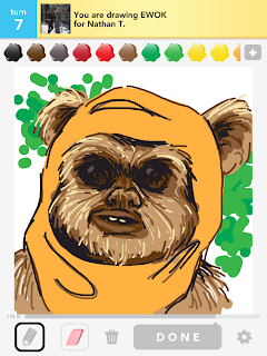
Drawing from bestofdrawsomething
The latest rage to hit the interwebs, as you all know, is OMGPOP's Draw Something (if you aren't familiar with it you can checkout my review of Draw Something on LightenApp.com).
According to their latest news, only 7 weeks after launching Draw Something was downloaded more than 35 million times and Zynga bought the company for $180 million.

We've seen it time and time again where a company takes an existing concept, that was not necessarily ever a big hit, puts their own twist on it, and the result is "overnight success". Google did it with search and Gmail (for example), Rovio did it with Angry Birds, and the list goes on... The OMGPOP story is far from an overnight success, as my good friend Shahar Nechmad noted in a recent post, but they definitely nailed it with Draw Something.


So what did OMGPOP do in Draw Something that caused this incarnation of pictionary to catch on so fast and turn into the amazing phenomenon that it became?

Here's my analysis.

Asynchronous playing - people love playing mobile games and they love playing with their friends. The problem with playing mobile games with your friends is that you typically need to all play at the same time, which is not very convenient when on a mobile device. You usually want to play on your phone when you have some spare time. In Draw Something the entire gameplay is based on asynchronous turns, so that whenever you want you can launch the app and play a round or two, even if your friend/s aren't currently online. When you finish your turn whatever you did is sent to wait for your friend. So you are playing with real people however you can always launch the app and get immediate satisfaction, even if nobody else is playing at that time. Even though it's asynchronous the game still lets you see what the other side experienced as they were playing, watching you draw. So you get the asynchronous game play without losing much of the real-time effect of playing with another live player.


Simultaneous games with several people - The downside of asynchronous games with real people is that you have to wait a lot between turns, till the other person finishes their turn and sends it back to you. The way OMGPOP solved that problem in Draw Something is by letting you play a lot of simultaneous games with many people.
When you complete a round with one person you don't have to wait around for the person to be online and play their turn, you just jump to another simultaneous game with somebody else. The game allows for enough games in parallel so that typical users will have enough games to play and not get bored waiting around. Since people are playing several rounds at once, each time you launch a round you first see the last drawing you drew for that user. That quickly reminds you where you left off and can continue playing from that spot.


Not being able to quit in the middle - Sometimes you run across players who don't really know how to draw well or are bad guessers. Draw Something is designed in such a way so that you can quit playing with anybody you don't want to play with, but the quitting point is at the end of a round. This subtle product feature keeps users engaged longer with the game than if you could just quit in the middle of a round just because the other user annoyed you ("can't you see that's a golf club???"). When you are in the middle of a round and get annoyed at the other user, you still have to complete the round (watch the user guess your word, watch them draw and try to guess, draw a new word). So effectively you can quit the round once you've finished drawing something. But don't you want to see if the user got your word? After all you just created this masterpiece, you don't want it to just disappear, never to be seen by anyone. Right? Ok, I'll go another round and give them another chance.... Not only does this create more activity within the system, it also give a chance for poor players to keep playing (and hopefully improve).


Limited set of letters to choose from - Not letting users just type in the entire word they are guessing, but forcing them to choose from a limited set of characters has 3 benefits. 1) It limits the possibilities for the curent word ("that looks like a dog but I don't have a 'd', I guess it's cat") which in effect increases the chances that people will guess the word, which makes both sides happier ("If he got the word I guess my drawing was good" and "I'm so smart I managed to guess that word even though it's an awful drawing"). 2) It helps with spelling problems, especially with an international userbase. 3) Finally, limiting the characters creates an opportunity for in-app purchases of bombs to eliminate characters and not lose your winning streak.


Easy random player hookup - Even if you don't know anybody who plays Draw Something you can just get the app, create a game, and find a random partner to play with. Since the game is asynchronous and simultaneous this really helped get the game started even when there weren't a lot of users using it yet (it was easy to seed the game with a small group of initial in-house players who took on the new users coming in).


Playing with actual friends - It's very easy to play Draw Something with people that you actually know, via Facebook Connect. And since the game is asynchronous you can even start playing with friends that don't even have the game yet. This both makes the game fun (it's more fun to play with somebody who you know in real life, vs somebody random) and makes the game viral. If you choose not to connect to Facebook you can still play against people you know via either their user name or email address.


Winning streaks + aligned goals - both players playing a round of Draw Something have the same goal, to guess the word. If I draw a good drawing and you guess it, we both win. Combine that with a winning streak counter and both sides have a mutual goal of keeping up that streak and not letting the other side down. This works exceptionally well when playing against friends you know via Facebook.


Not all the things Draw Something did were so outstanding, but these things are what caused the game to be both fun and viral among friends, which led to its great success.

Here are a couple things they didn't do that well on, and will hopefully improve in their upcoming versions:

The user interface when logging in is not standard and actually quite weird. Instead of asking for your email/username and password they ask for your email and username. I've seen more than a few people put in their email and then type their password in the username field (because it looks like it should be the password field) and what happens is that you now get a new username that is your password. Not cool at all.

They also screwed up the Facebook integration when you choose to sign in with a user name instead of using Facebook Connect. If you use a username you can't then connect to Facebook and play against your Facebook friends. That's both less fun and less viral, both sides lose.


In their next version of Draw Something they will let people share their drawings easily on Facebook and Twitter (among other things they'll be adding). This will create more engagement around the game among friends and increase their virality.

I can't wait to see what other product improvements they'll introduce that will make Draw Something an even bigger success....
Share:

28 February 2012

GrrReader


Google recently moved the Google Reader link into the "More" section of their top navigation bar (you know, that black toolbar that they added to all of their sites when they launched Google Plus).

For those of us who use Google Reader regularly, it's quite an annoyance. Not only the fact that it's now harder to access Google Reader, but the fact that Google can change whatever they want in these tools that we use daily, and we pretty much have nothing to do about it.

So I took the opportunity to create a Chrome extension that adds it back to where it belongs, on the navigation bar itself.
The extension was pretty simple to write and gave me a chance to brush up a bit on my Javascript skills (especially JQuery stuff).

If you're interested, you can find the Chrome extension for download from the Chrome Web Store (it's free obviously).

Comments are welcome...

Share:

15 January 2012

Discovering Apps

I recently started an additional site about app discovery: LightenApp.

As you can probably tell by its name, LightenApp is focused entirely on apps, mainly iPhone apps.

The format is simple: short app reviews added daily.

If you want to discover new apps and get tips and recommendations, just subscribe to LightenApp on any one of these channels:
Like it on Facebook:

Follow on Twitter:


Follow on Google+:


Get the RSS feed:


If you know any good app that you think should be reviewed, let me know.

Share: