06 December 2011

Designing a Logo

We recently changed the name of our company and one of the implications was that we needed to create a new logo for the company.
The name of the company is iglloo (igloo.com was taken, big surprise, but we managed to grab iglloo.com) and when we chose that name I immediately envisioned us having some kind of cute logo, although nothing specific came to mind.
For some reason, we thought it would be pretty easy to create the imagery that goes along with the values what we want our brand to represent (in a nutshell we build apps, primarily for iPhones and iPads), but we quickly learned that creating something "real" out of our vague thoughts, was not an easy task.

We tried a few concepts but the designs that we got were too literal. We kept getting images of igloos.
Things like this:
Which is cute, but not more than that. We were looking for something sophisticated, simple, and fun.
I had envisioned a simple textual logo, with an igloo incorporated somehow as part of that textual logo.

So we decided to open a contest on 99designs
If you aren't familiar with 99designs, it lets you setup a contest for any graphic work you need. For example, you can create a contest for designing a web page and offer a $300 reward to whomever designs the best page for you.
Lots of designers hang around 99designs looking for projects to work on and they may see your project and submit a design, hoping it will win the contest and they'll get paid.

Similar to the X Prize (and the original Orteig Prize which Charles Lindbergh won in 1927 for flying non-stop from New York City to Paris), the idea is that the sum of all the effort put in to the competition by the participants is greater than the value of the prize.

Essentially you get tons of people working for you for free and one of them gets overpaid a bit for their effort.

Sounds like a great concept, especially for things like graphic design.
I heard from a few people about different results on 99designs, some were really happy and some didn't like the quality of the work they got there. So we decided to go with the cheapest option there ($299) and give it a try.

Within a week we got 38 designers who submitted about 140 design concepts for our logo.
Some were WAY off and a few were quite close to the concept we had imagined and tried to describe to the designers, but none of them really stood out. We were basically looking for a stroke of genius.

Here are a few of the designs that were kinda of the concept we were looking for (some after refinement based on our comments to the designers):


In our opinion, none of them were really spectacular/genius enough and we were pretty disappointed with the results.

At that point we pretty much gave up on the contest, didn't award a winner, and went on with our day to day business (still using the old brand). The rules at 99designs are that if you don't pick a winner you don't have to pay. We were definitely willing to pay full price for the design, if there was something that we liked.
I must say, the support team at 99designs did a great job. They were very accommodating, they offered to extend our contest longer because we hadn't decided on a winner yet (contests are typically for 1 week) but we still didn't get good enough results.

At that point I even tried to create the logo myself and came up with this idea:


I actually really liked the concept (I guess I'm just in love with my own ideas) but the problem was that it doesn't scale. At small sizes that little igloo image is totally not clear.

After about 2 months the logo issue came up again and I went back to 99designs to see the old submissions, maybe looking at them again would give a different perspective. Still nothing spectacular.

Since 99designs offer a refund if you don't pick a winner, I sent them an email and asked how I get the refund. They replied that they can only refund within 60 days and that more than that had passed.

They did offer to reopen our contest and basically start over. So we reopened the contest, again for 1 week.
This time we got WAY fewer submissions. I'm not really sure why (I asked their support and they didn't have any good answers). They also offered to give us their PowerPack for free which basically gets you better listings in their directory along with a few other tweaks so it stands out (usually $85).
The PowerPack didn't make any difference, we just got a few random submissions, nothing even close.

Then while looking at all the different submissions I suddenly ran across this design from the original contest:

I never really noticed it because it "wasn't what we were looking for", we were looking for some kind of genius twist as part of the textual logo.
But this was interesting.
We showed it to a few people around the office and everybody pretty much liked it.

I asked the designer for the meaning of the icon and this is what he sent in reply:
The meaning of the icon according to the designer


Ok, I can live with that.

We then went back and forth playing around with different fonts and stylings, these were among them:

At this point I was just exchanging emails with the designer, going back and forth about different things like the dot above the i, what L's to use, etc... According to 99designs, during the handoff process you can ask for some changes but the designers aren't obligated to do anything. Beehive, the designer who created this logo, was very responsive and helpful. 

After about a day of mixing and matching different elements from different fonts (and trying to keep it from looking like a Frankenstein-ish mess) we finally came up with the final design!

It wasn't what we had originally envisioned in terms of the concept, but it does the job.


And without further ado, here is the official new logo for iglloo:


So do I recommend using 99designs?
To an extent. While looking around there at different projects (I was looking to target designers who created things I like) I saw some pretty good designs.
My feeling is that it's kind of a crapshoot, with relatively good odds.
You may be able to get something really good for not a lot of money but you may leave disappointed.

If you can afford $299 then I would give it a try.
I think logos are particularly difficult to design (the story behind the Conduit logo is quite long too) but if you are looking to design a website you'll probably be able to get good results (although 99designs may be a bit more expensive than just buying a template and customizing it a bit).


Share:

06 November 2011

Twylah - Your Trending Tweets

One of the annoying things about Twitter is that things that you tweet just vanish into the ongoing flow of tweets and disappear forever, never to be seen again by a human being (and Twitter's horrible search engine makes that problem even worse).

I recently ran across a great service that addresses this problem - Twylah.
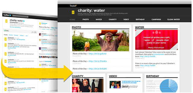
Twylah analyzes the content that you put on Twitter and automatically generates a site for you which gives your readers a beautiful summary of who you are and what you tweet about.
That page is also optimized for SEO which is a great way for you to drive new traffic back to your content.

So basically, instead of sending people to your boring old Twitter page (which may be filled at the moment with irrelevant tweets because you just happen to be in an ongoing conversation with somebody on Twitter about the latest episode of Beavis and Butthead), you send people to your Twylah page.

That page will show them your personal trending topics and what you are all about.
My Twylah page, for example, currently shows that I tweet about Twitter, iPhone, Apple, Games, and Nike (I recently ran in a Nike run so I've been tweeting about it).

Look at the difference between a regular Twitter page to the Twylah page generated from it:


It's much easier to understand what kind of stuff you tweet about and it looks much better.

I assume Twylah is mainly targeting brands to use this but I see no reason why any individual who is on Twitter wouldn't want to use it.

Check out my Twylah page and you can request a beta invite to get your own.

Share:

25 May 2011

Leaving Conduit


After nearly seven amazing years at Conduit, I have decided to leave the company and pursue other ventures.

This journey started in a room with a small group of all engineers that quickly grew to an outstanding company with over a quarter of a billion (that's right, with a b) of monthly users and a network of hundreds of thousands of publishers. A dream come true for anybody trying to create something online.

Screenshot of an early version of the Conduit homepage
One of the first versions of the Conduit homepage


Over the years I've had the privilege of being involved with many different aspects of the company at different stages: from hands on technical roles, to dealing with our very first customers and users, marketing to the long tail, managing support, product definitions, meeting new prospective publishers, leading product, and the list goes on and on.

This experience has been life changing and gave me the rare opportunity to accompany a company from it's inception, throughout the different stages, the ups and downs, up to a huge success story with hundreds of millions of users and a multi million dollar revenue stream.

I would like to thank all the great people who I've worked with over the years at Conduit and am sure that they will continue to make this company a true game changer.


What now you ask?
(ok, maybe you didn't ask but I'll tell you anyway)
Over the past few years, we've all seen the explosion in the mobile web space. Instead of saying "here's an idea for a startup" people now say "here's an idea for an app" (I even unknowingly tweeted this a few months ago http://bit.ly/l8I6Jm). With the easily accessible platforms and infrastructures we currently have, I believe there is a lot of potential for solving problem with the mobile Internet, and that's what I plan on doing.

I've partnered with Shai Wolkomir, a serial entrepreneur but most importantly an old friend, and together we plan to change the world. Or at least have fun trying to do so.
We've assembled a small but very capable team that will give us the ability to try out our ideas and quickly see what works, what needs refining, and what should be thrown out.

The first product to hatch out of our nest is Props which is a way for people to give recognition to people for things they are good at and get the respect they deserve.

So far it's getting a lot of great responses from the people who saw it at TechCrunch Disrupt and we have a lot of plans for it.

So without any further ado: go install it and let me know what you think :)

Cheers,
Guy
Share:

06 April 2011

Techonomy3 - The Rundown


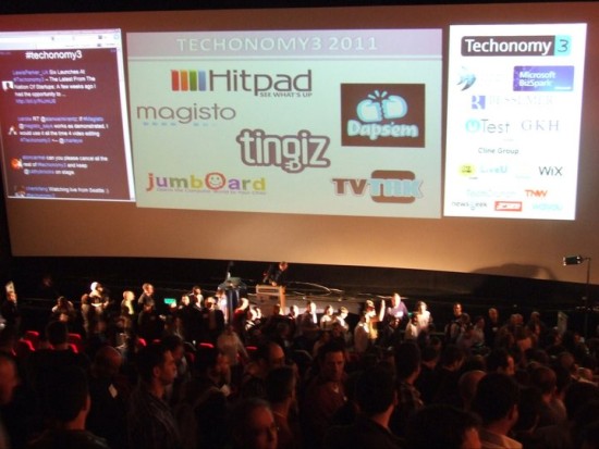
(Photo by Yaniv Feldman - Newsgeek)

This is a repost of an article that I originally wrote for Technorati and was published there.

The startup scene in Israel is booming, and a(nother) testament to that is the Techonomy3 conference, which just wrapped up not long ago.
The format is simple: 6 startups presented to about 400 attendees in the room (and probably a few thousand viewing via the live video stream from around the world).
A panel of respected, well-known judges gave their comments after each presentation, and the audience voted on the winner, American Idol style.

America (well, Israel actually), here are your top 6:
  • Hitpad - an iPad app that automatically gives you highlights of what's going on today by analyzing different online sources and giving you trending topics with drill downs of topics you're interested in. Very cool.
  • Dapsem - an iPhone app to give your friends virtual fist bumps as a sign of appreciation. The concept of giving recognition to people you know is great and has huge potential.
    From what I've seen, Props are the ones to keep your eyes on in that space.
  • Magisto - a web app (remember those? :) that automatically detects interesting content in your videos for creating professional looking edits of your videos. Like Animoto but with zero effort.
  • Tingiz - a platform for creating mobile microsites for products. Manufacturers of physical products can create a mobile microsite for their products and connect them via a QR code. The product microsites will show things like product videos, information, Facebook page, etc...
  • Jumboard - a large plastic PC keyboard with big red, yellow, blue, and green buttons that let little kids easily interact with Flash apps on Jumboard.com. This gives young kids an interface they can easily use to start interacting with games/applications and parents get feedback on the progress of their kids. Kinda like a modern incarnation of the Comfy keyboard.
  • TVtak - an iPhone app for easily getting information about TV shows. All you do is take a picture of your TV while watching a show and TVtak will recognize what you are watching and give you information about that show (and let you share it with your friends). Very much like Shazam does for music.
Based on the reactions of the crowd and the live Twitter board (which was on fire during the event), Techonomy was a huge success for everybody involved.

And without any further ado... the winner of Techonomy 3 is.....
Magisto!

Congrats to the winners and to the organizers of this conference, they put on a great show.
And to the losers: "it's an honor just being nominated", or in this case, just being on stage.
Share:

21 March 2011

19 March 2011

Summing Up SXSW

This is a repost of an article that I originally wrote for Technorati and was published there.


South By Southwest Interactive is (finally) over and we can all get back to our normal lives (unless it's normal for you to go out every night, meet hundreds of people, and get free food and drinks everywhere you go).
For those who don't know, South by Southwest (SXSW) is a set of interactive, film, and music festivals and conferences that take place every spring in Austin, Texas.

Here's the rundown for this year's SXSW highlights, disappointments, winners, and losers. These are all based on both my personal experience there and on feedback that I got from talking to tons of other geeks and techies there.

Highlights
  • Klout party - Klout rented a house, had food, drinks, and a live band (Audio Runner). But what made it stand out was that they had a good crowd and the timing: noon on Saturday, which is kind of a downtime in terms of events. Just a good time talking to cool people on a Saturday afternoon.
  • 140conf party - Tons of great people at the Lanai + open bar = great time. Jeff Pulver really knows how to draw in a crowd and everybody enjoyed themselves.
  • Lean Startup party - SXSW is all about people, people, people. Dave McClure and Eric Ries got a great group of people together, that's what this event was about. After a few hours at the Lean Startup party, the group I was with that night actually left to go to the foursquare party, and then came back to the Lean Startup event since it was so much better.
  • Conduit pool party - obviously I'm totally biased here so I didn't want to include Conduit's party in this list. The only reason I decided to include it was because other people kept saying it was one of their highlights. So for those who missed it, Conduit had a pool party BBQ on Sunday afternoon. The setting was quite different from other events: it was held at the pool of the prestigious Ashton Austin condos. The setting, timing, food and drinks were great and lots of people actually got in the pool despite the cloudy skies.
  • SVB - SVB packed the two floors of the Parkside on 6th with top notch people. Everything from investors like Tim Draper to bankers and entrepreneurs were there. And they had a live 80s cover band, great dinner, and surprise show by Andrew Mason (CEO of Groupon) playing the piano to top it off.
  • Pud meetup - this relatively small meetup (probably about 30 people) was organized by Phillip (pud) Kaplan founder of Blippy (among a ton of other things). Forget the pizza and hotdogs, just chatting with cool people like Alex from Million Dollar Homepage, Aaron founder of Urban Dictionary, and Bram from Bittorrent was awesome.
  • Foo Fighters surprise show - for those who got in (the lines were LOOONG) was a fun way to end the SXSWi craziness.

Biggest Disappointments
  • The conference itself - most people I know didn't even bother to try to go to the sessions. A surprisingly large amount of people actually didn't go pick up their badges. The best parts were all the events around the conference, the actual conference was not an attraction.
  • Fousquare party - tough time getting in so you'd expect it to be killer (and lots of people were talking about it) but checking in here was not worth it.
  • Mashable Billiards - a lot of noise around this one. The people at the door were REAL a#@holes. Not what you'd expect from Mashable
  • Twitter retreat - this was a weird one. Expected it to be big and fancy since Twitter was hosting. Was very small, secluded, and not that interesting.
  • Facebook developers garage - a bunch of people I know tried to find this event but couldn't. Either they canceled last minute or Google maps is WAY off, because nobody I know managed to find/hear anything about this (and we looked a lot).

Winners
  • Hashable - forget business cards, Hashable is the way to go when you meet somebody new. I would say 3 out of 5 people I met at SXSW were using Hashable, especially people from NYC. Hashable rocks but I do agree with what my friend Nate Lustig wrote, the only downside is that Hashable strips the personality of your business cards into about 100 characters available in a Hashable tweet. I enjoy seeing the creativity in business cards each year at SXSW.
  • GroupMe - there were tons of group messaging apps trying to push themselves at SXSW. For some reason GroupMe caught on. If you managed to get on the right GroupMe group you'd get insight to where the hot spots are (and get a lot of junk messages).
  • Plancast - one of the hardest things at SXSW is to know about all the different events. Plancast are awesome at tracking where people are planning to go and letting you follow people that are in the know.
  • Foursquare - another method of tracking where everybody is going: just follow the right people on foursquare and see where they checkin. Gowalla were surprisingly quiet even though they are based in Austin.

Best Giveaways
  • Squarespace - free food. Good food. Every day.
  • Sobe - had an outside bar with both cocktails based on Sobe and just free Sobe lifewater drinks. Lifesaver. Plus always a nice crowd there.


A Squarespace lunch: bacon donut

Best Hangout
Driskill Hotel lobby - at the end of every night (and beginning actually) the Driskill lobby was always packed with TONS of very interesting people. Really can't beat that.

Biggest Pain
  • Cellphone battery life - With all the checkins, Hashable, Google Maps, Plancast, etc… you'd be lucky if your iPhone lasted through (free) lunch. Some companies tried to help by giving away free battery packs but only a small elite group managed to get those.
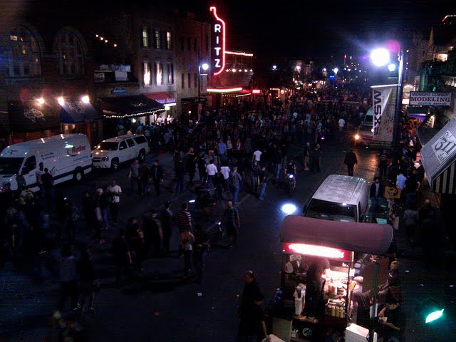
  • Craziness - just trying to keep up with all the craziness was hard. So much going on there was no way to really keep track. And forget about trying keep up with the real world and answer emails.

One thing is for sure though: see you next year South By...
Share: